Onyx & Amber;
Born of Earth & Ember
Brand Identity, Logo, Packaging, Collateral
The Situation —
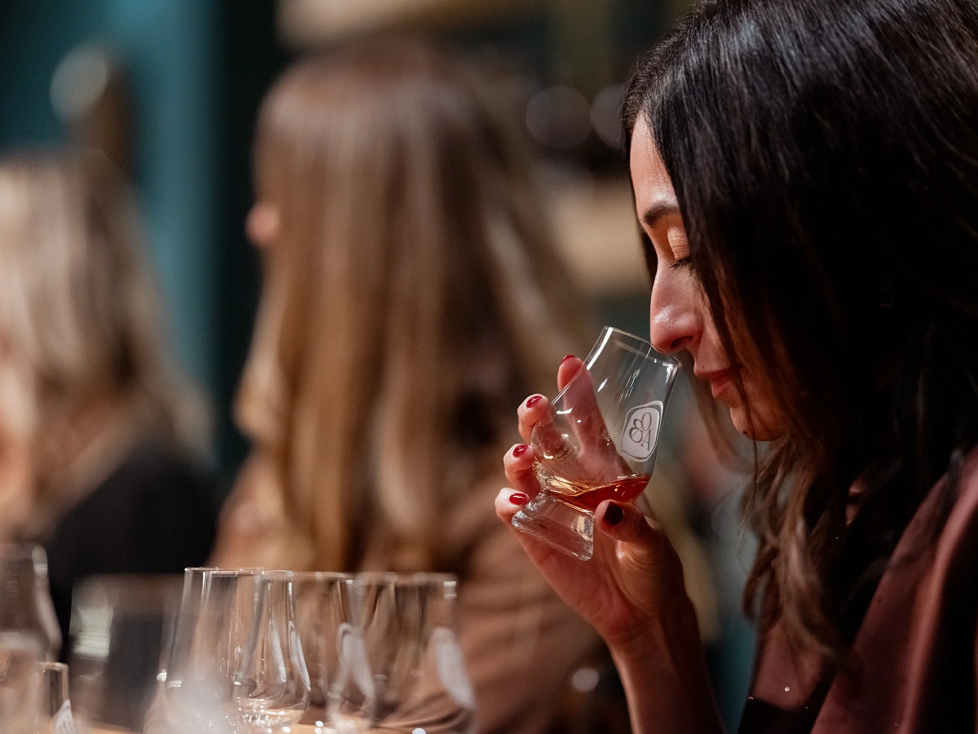
Onyx & Amber began as a decade-long bourbon and rye enthusiasts’ club that conducted 150+ single-barrel selections, raised over $500,000 for charity, and ultimately uncovered something rare: Colorado’s climate transforms aged whiskey into richer, deeper, more concentrated expressions. With no high-end Colorado whiskey that captured that discovery—and with the passionate, unhurried barrel-picking experience—founder Ben Rosen built Onyx & Amber to bring both back to life: a whiskey and a way of drinking it rooted in curiosity, transparency, and discovery.
The Solution —
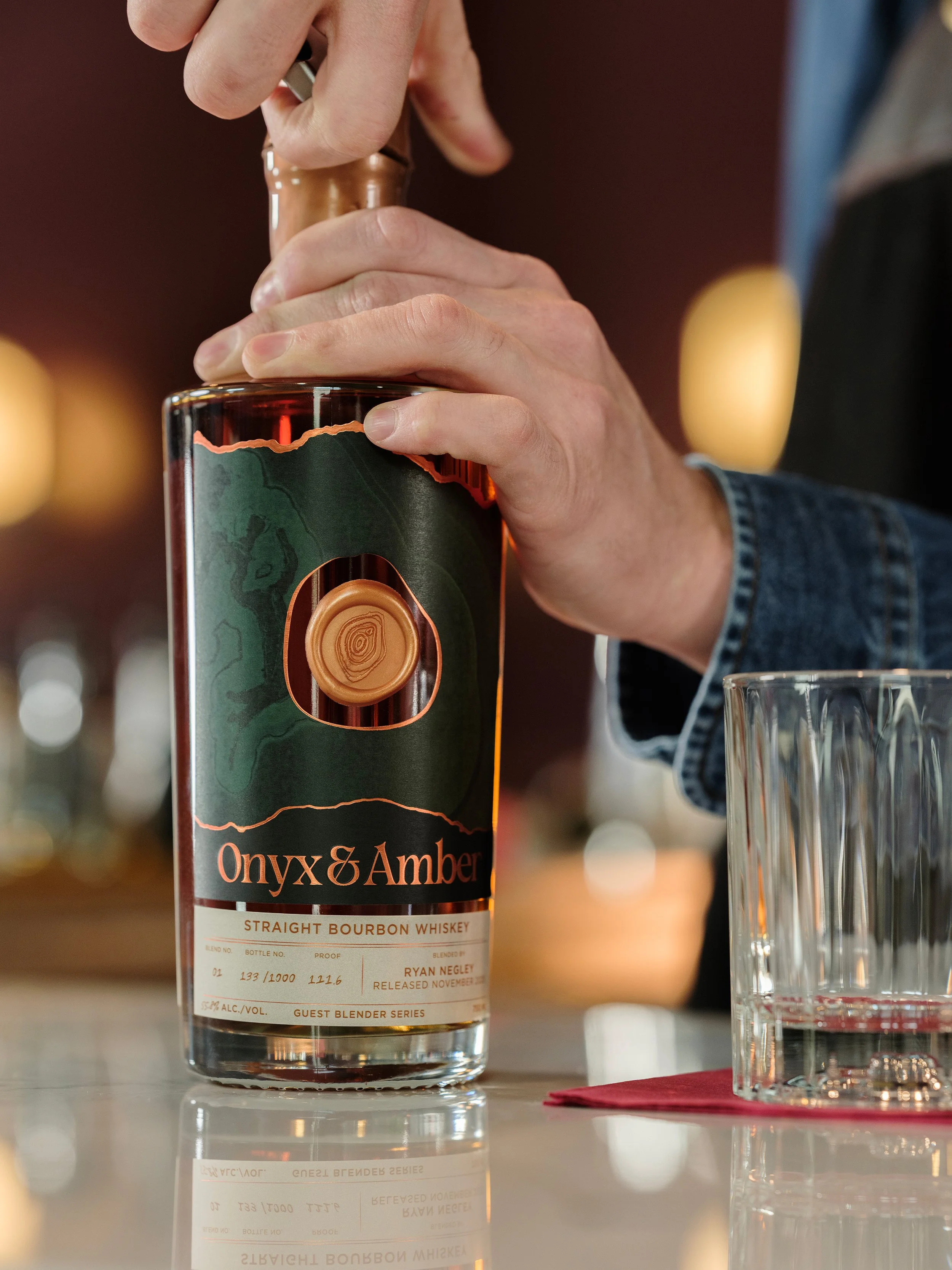
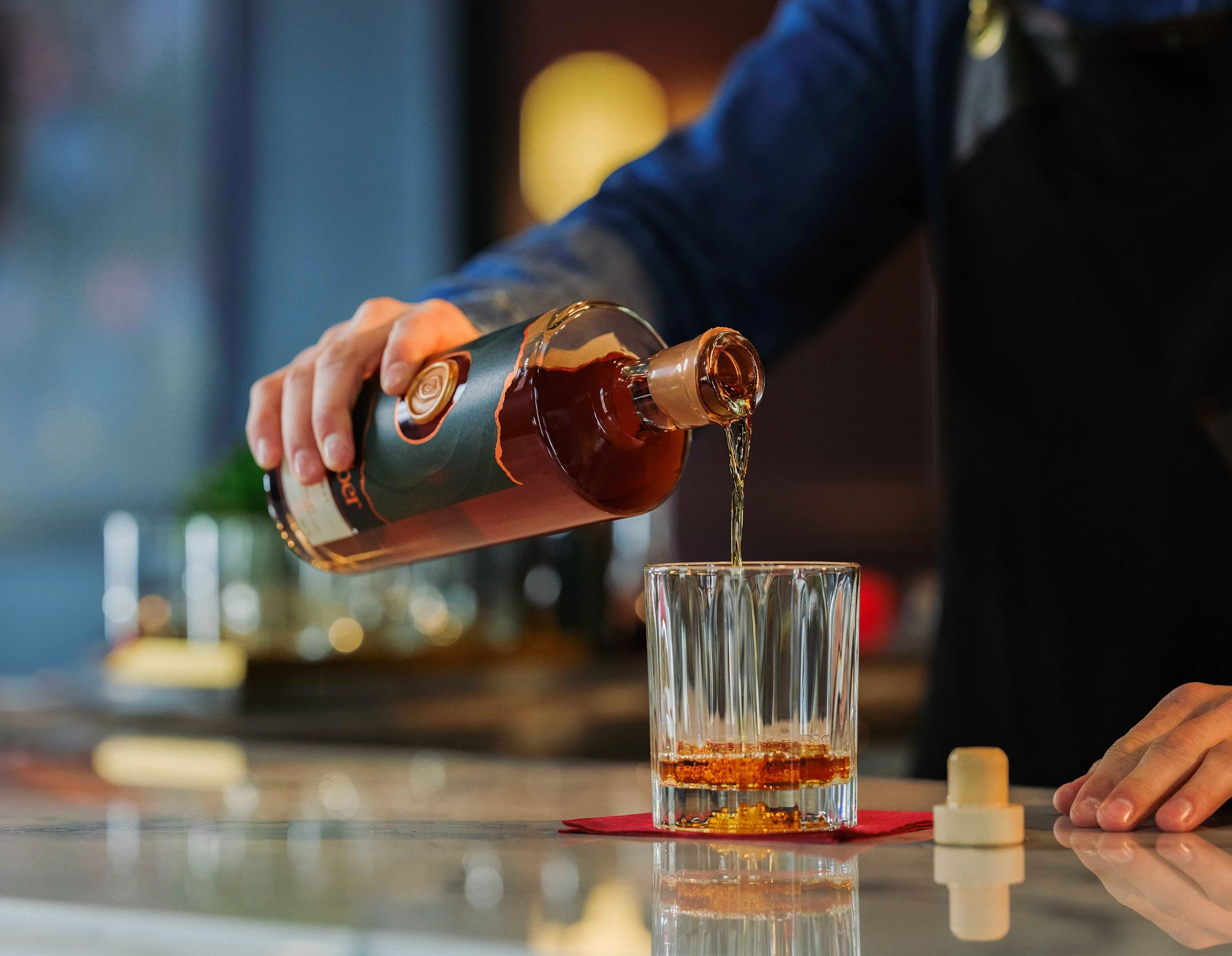
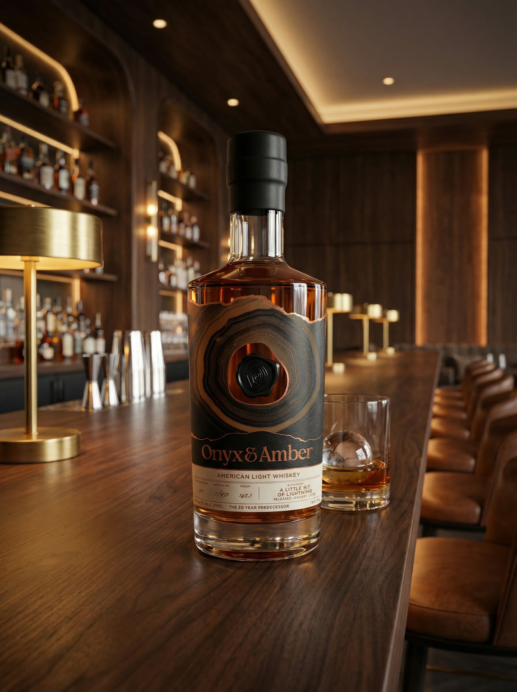
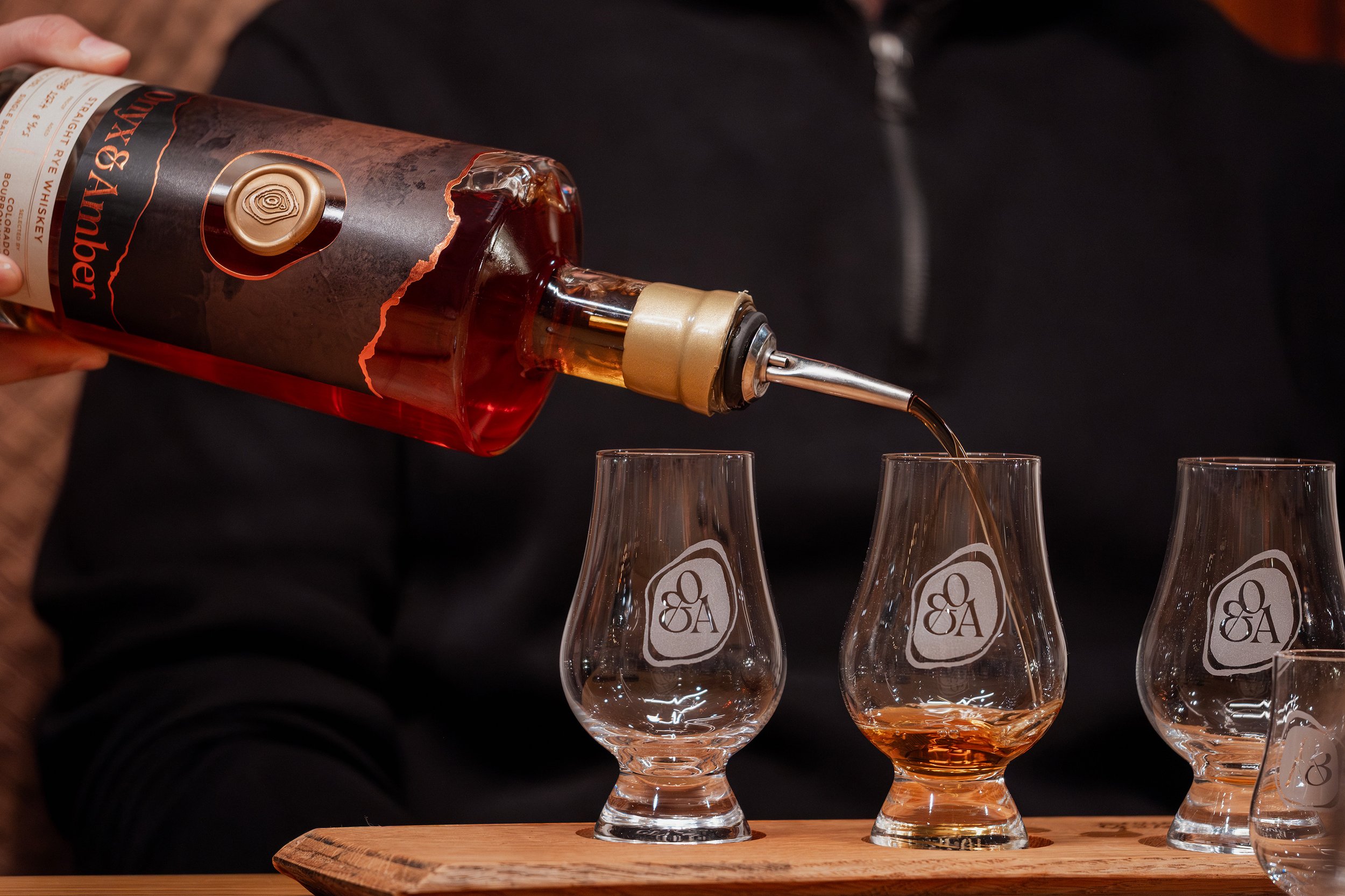
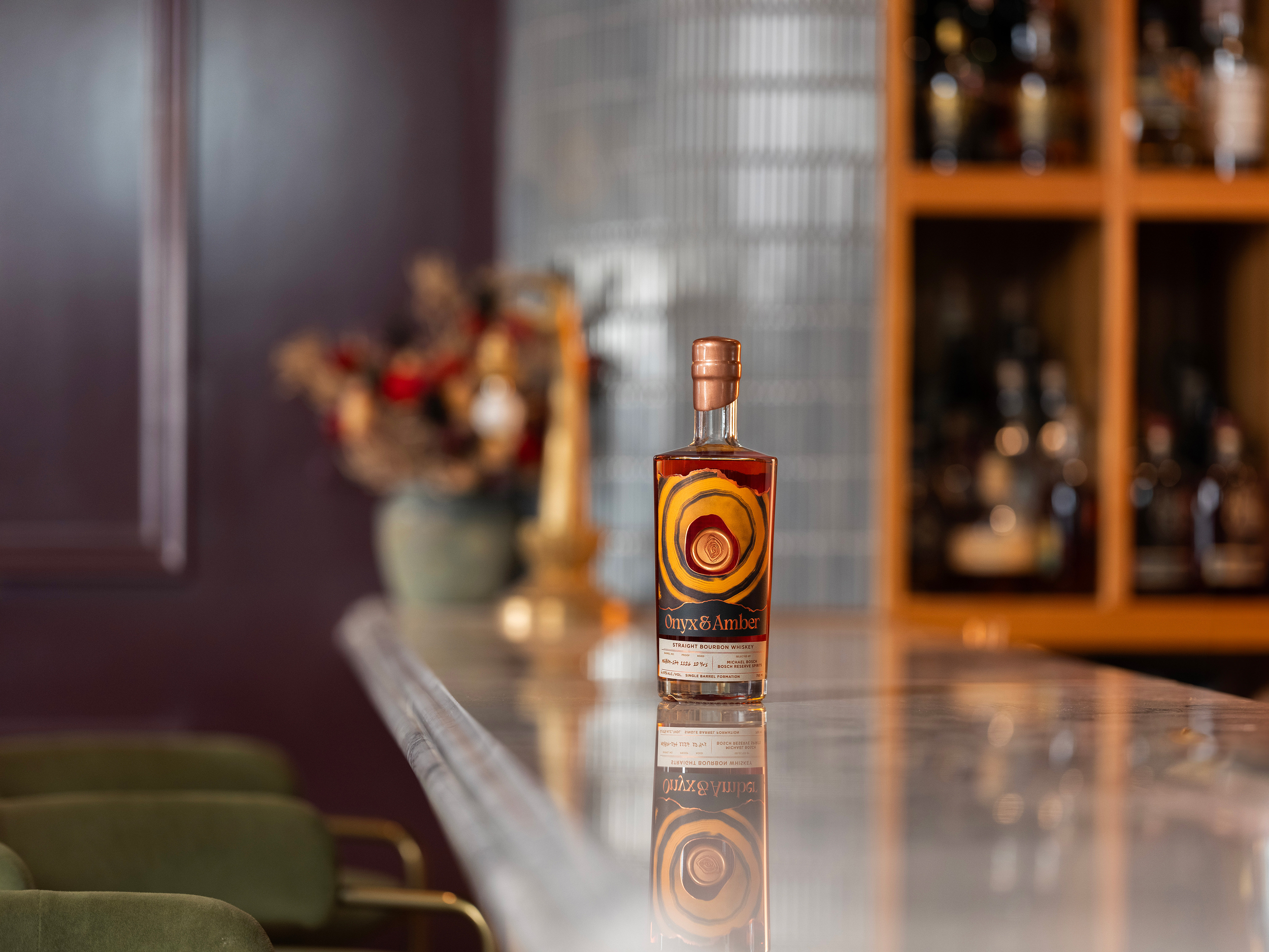
Onyx & Amber came to Americano with a clear vision and a strong foundation. Our role was to bring the visual language up to the level of the whiskey itself — to give the exterior the same depth, restraint, and intensity resting inside the barrel.
We refined the identity into something grounded and permanent. Strong typography. Intentional structure. Tactile finishes that feel pressed from the earth rather than printed on paper. Even the label paper reflects the ethos—produced from stone rather than trees—a subtle but powerful nod to the brand’s elemental core.
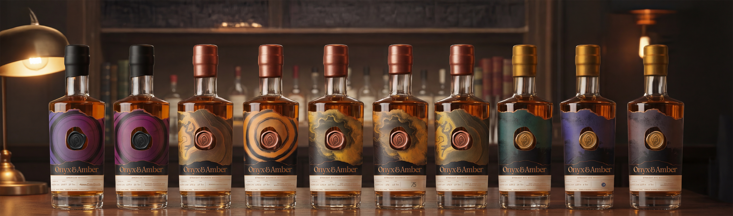
Behind the beauty is a system built for longevity. A layered, highly flexible visual framework that allows Single Barrel Formation releases, blends, and special offerings to evolve without losing cohesion. Each barrel can stand alone, yet together, they build a collection.